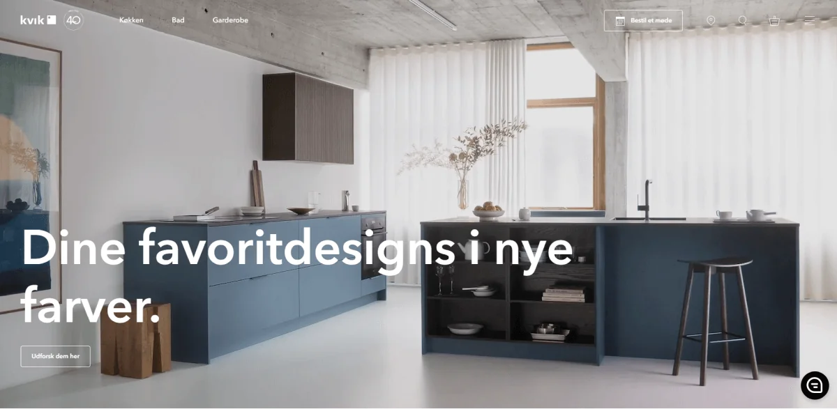
Kvik sells kitchens through conversations. The moment a visitor books a meeting with a salesperson is when browsing turns into a project. The old website was organised like a product catalogue, though, and the booking path sat several clicks deep.
At Merkle, as Lead UX Designer and Experience Architect, I led the redesign around how people actually buy a kitchen, then took it through a rollout to 13 markets.
My part
- Built the as-is customer journey and ran the cross-team workshops that set the new information architecture.
- Ran a three-day design sprint on the booking flow and tested three variants with users in two markets.
- Delivered UX, UI and technical documentation through dual-track agile delivery, as one design system went live in all 13 markets.
The site was built around the catalogue
I started by putting analytics and stakeholder interviews into one as-is journey: what people did on the site, set against what Kvik's teams believed they did. Then I used that journey as the shared map for a series of workshops with teams from across the company. The workshops decided the new information architecture. They also turned up quick wins we could ship while the bigger redesign was still being planned.
From as-is to to-be
Before
- Navigation mirrored Kvik’s product range and org chart
- Every market patched its own pages, so fixes didn’t travel
- Booking a meeting was buried several clicks deep
- Design files and the live site had drifted apart
After
- Navigation built around the tasks of buying a kitchen, agreed in workshops
- One component library that all 13 markets build from
- A visible, shorter route to booking a meeting
- Tokens and documentation that design and development both work from
Deep dive: the booking flow
The journey made one moment stand out. A booked meeting was the most valuable thing a visitor could do short of buying a kitchen, and it was the hardest to reach. So it got its own sprint.
Sprint to shipped
- 01
Research
users + stakeholders
- 02
3-day sprint
rapid prototyping
- 03
3 flows
distinct variations
- 04
Maze test
2 markets
- 05
Ship
live on kvik.dk
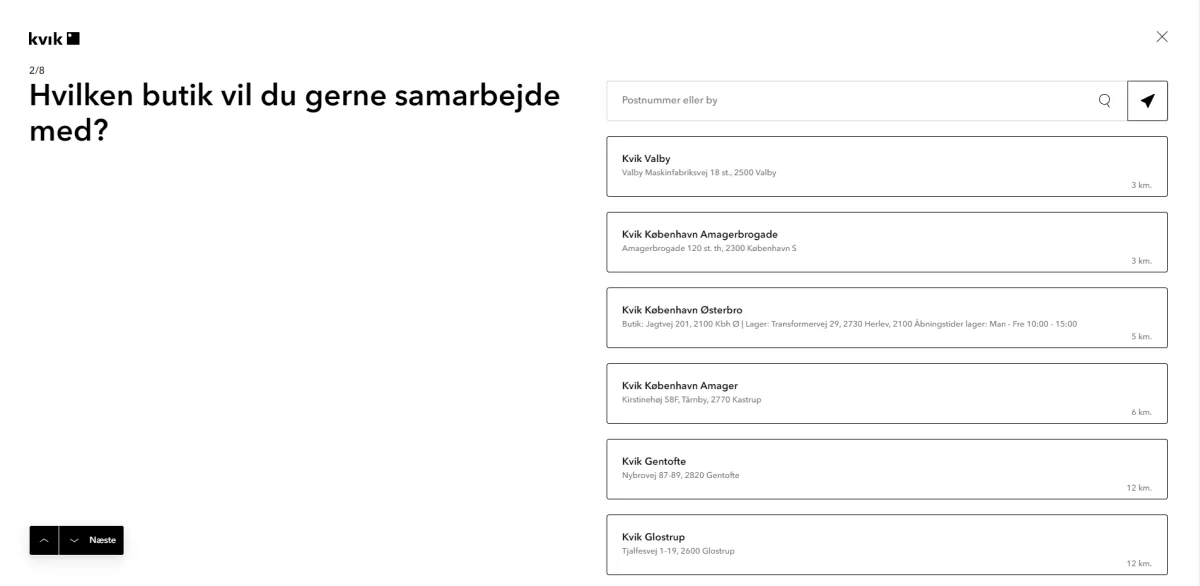
We collected what users and internal stakeholders expected from booking, then spent three days prototyping different ways to do it. Three flows came out of the sprint. We tested each one remotely in Maze with users in two markets, combining task data with follow-up interviews.
The flow that shipped takes eight short steps. It asks where you are, what you're planning and how you'd like to meet, and books you with a salesperson who can actually help.
A system built like the product
A Kvik kitchen is modular cabinets on a fixed grid. We used the same logic for the website: a modular grid and content blocks that market editors combine into pages, the way customers combine cabinets into a kitchen.
Underneath sits a token layer. Colours are named by role, not by hue: foreground, background, border crossed with action, attention, crucial, success. Each one has a default and an active state. The type sizes are fluid and scale with the viewport, so one set of values works from phone to large desktop. A market can localise every word without touching a component. (This portfolio uses the same token-driven approach.)
Kvik’s token layer
| Token | RGB | Hex | Role |
|---|---|---|---|
| fg-default | 24 25 26 | #18191A | Body text |
| bg-emphasis-default-default | 10 10 10 | #0A0A0A | Primary CTA (“Bestil et gratis møde”) |
| fg-action | 43 97 180 | #2B61B4 | Links, action |
| fg-sea | 54 104 135 | #366887 | Brand accent |
| bg-emphasis-aubergine-default | 127 87 108 | #7F576C | Brand accent |
| fg-success | 39 115 13 | #27730D | Success |
| fg-attention | 127 93 0 | #7F5D00 | Attention |
| fg-crucial | 197 22 26 | #C5161A | Errors |
| fg-muted | 128 129 130 | #808182 | Secondary text |
- Colours are stored as bare RGB triplets, so one token serves any opacity: rgb(var(--fg-action) / .6). Every colour sits on two axes: layer (fg, bg-base, bg-emphasis, bg-feature, bd) and intent (default, action, attention, crucial, success, neutral, sea, aubergine), each with a default and an active state.
- Type: Kvik Avenir, headings 600, body 400/500, base 16/24px. display clamp(3.25rem, 8.75vw, 6.875rem) · title clamp(2rem, 5.25vw, 3.5rem) · heading-xl clamp(2rem, 5vw, 3rem) · heading-md 1.5rem · paragraph-md 1rem · caption 0.75rem
- Spacing: xxs 24 · xs 32 · sm 80 · md 128 · lg 192 · xl 256 · xxl 320 px
- Radius: sm 2 · md 4 (buttons) · lg 8 · xl 16 · full 1000 (pills) px
- Layout: 12 columns · 24px gap · 128px margin · max widths 600 / 800 / 1200 / 1920
- Border: sm 1.2 · md 2 · lg 3 px
How it shipped
We worked in dual-track agile, with design running a sprint ahead of development. Along with every design, I handed over the features, user stories, acceptance criteria and CMS settings, so developers and 13 sets of market editors built from the same spec.
Result
The bounce rate fell by 11%, and booking conversion rose in every market from 2021 to 2022, led by Germany at almost 60%:
Booking conversion lift by market, 2021 → 2022
- Germany60%
- Denmark20%
- Norway10%
- Sweden8%