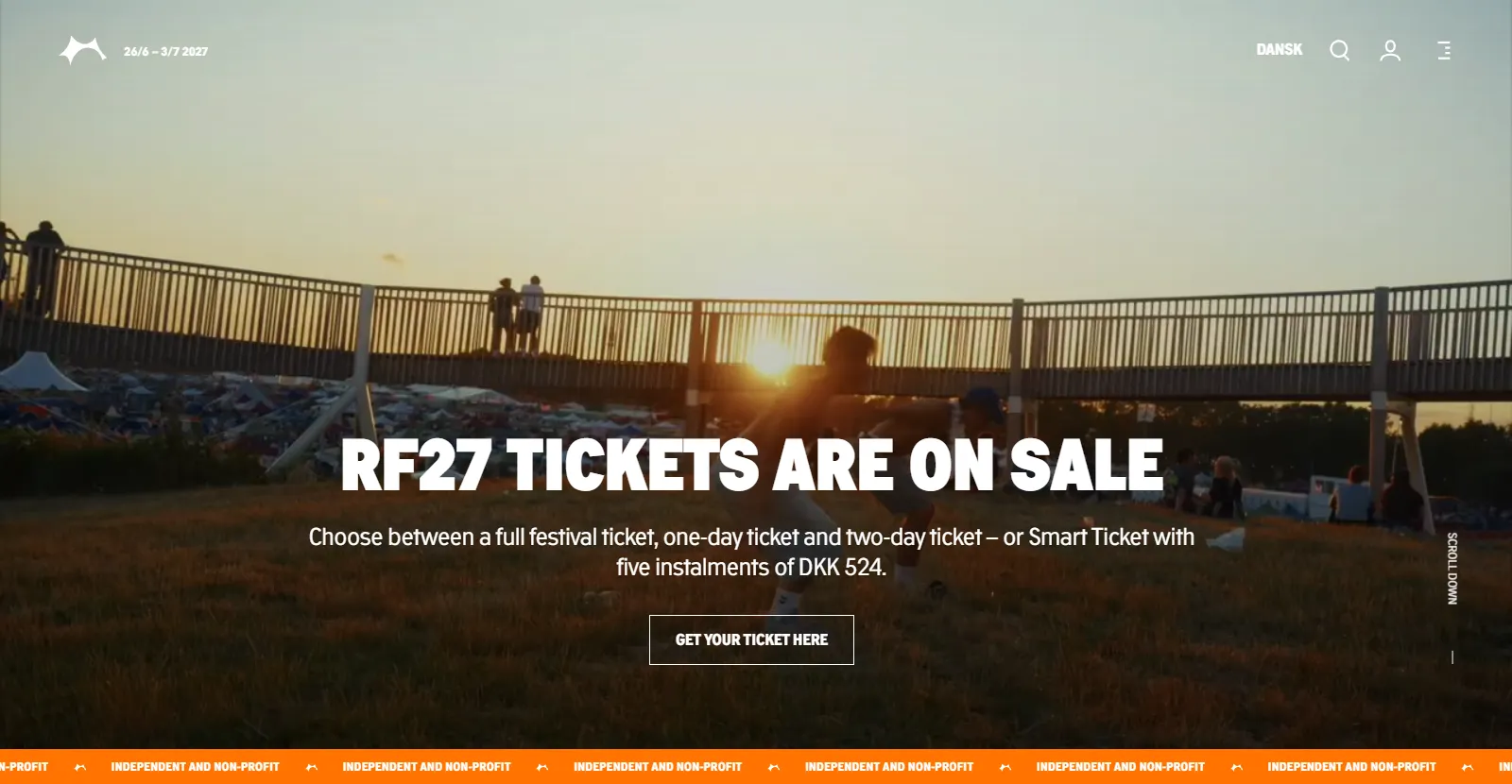
Roskilde Festival is non-profit, volunteer-run and part of Danish culture. I've stood in that crowd more times than I can count, so working on it as Lead UX was one of the best briefs of my career.
The job was to move the festival's websites onto a headless frontend and one shared design system. That foundation had to carry the festival itself, Roskilde Festival Group (the non-profit association behind it), and two younger ventures, RFX and GRASP. Each has its own audience and its own tone, but they shouldn't need their own codebases.
A note on scope: my hands-on work was the website, but the future-state journey covered every digital touchpoint a guest, member or volunteer meets. The website was designed as one part of that journey, not the whole of it.
Process
01
Map
Audited all four properties to capture the real as-is state.
02
Define
One headless frontend, with a theme per brand.
03
System
Built the components and tokens every brand shares.
04
Deep-dive
Took login and the programme end to end.
Four sites, four of everything
Before designing anything, I mapped what was there. The pattern was the same on every property: each had grown on its own, with its own components, its own login and its own front-end code. Decisions that should have been made once had been made four times, each slightly differently. Every change was slow, and anyone moving between the festival and its ventures met a different experience each time.
The as-is, across four brands
Before
- Four codebases and four component sets, maintained in parallel
- A different journey every time a user crossed from one brand to another
- A login built and styled differently on every property
- Every design decision made four times, slightly differently
- Content locked to its page layout: slow to change, impossible to reuse
After
- One headless frontend and one component library
- The same core experience, in each brand’s own voice
- One reusable login flow
- Brand differences expressed as token values, not separate code
- Content separated from presentation: edit once, publish everywhere it appears
Defining the future state
We mapped the future state as a customer experience first and a technical decision second. The to-be journey covered every touchpoint a guest, member or volunteer moves through, and that journey set the requirements for the platform underneath.
The platform rested on two decisions: separate content from presentation, and put every brand decision in tokens. Shared content and shared components come through the headless frontend, and a token layer carries each brand's identity.
Same names, different values
The hardest part of a shared system is letting each brand still feel like itself. So the rule was simple: every theme has exactly the same token names. A brand is only a different set of values.
Each theme defines the same 100+ tokens: twelve colour contexts (black, two greys, white, primary to quaternary, and four UI states), each with eight roles (colour, accent, on-accent, contrast, tone, tint, navigation, error), plus tokens for typeface, text case, font weight, gutters and button shape. Components never know which brand they're rendering. Switching data-theme on the page is the whole difference.
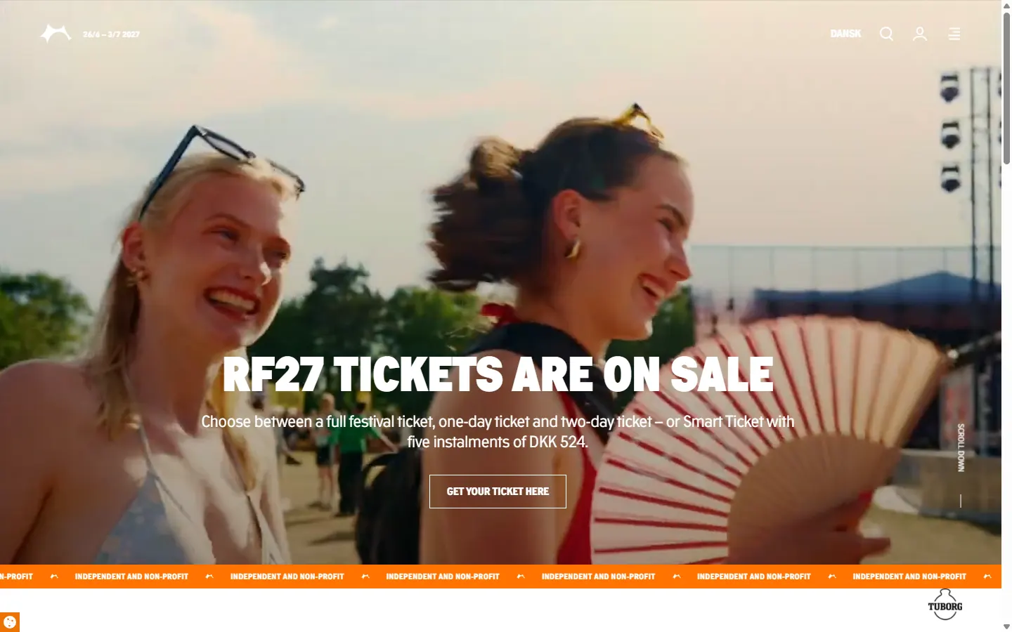
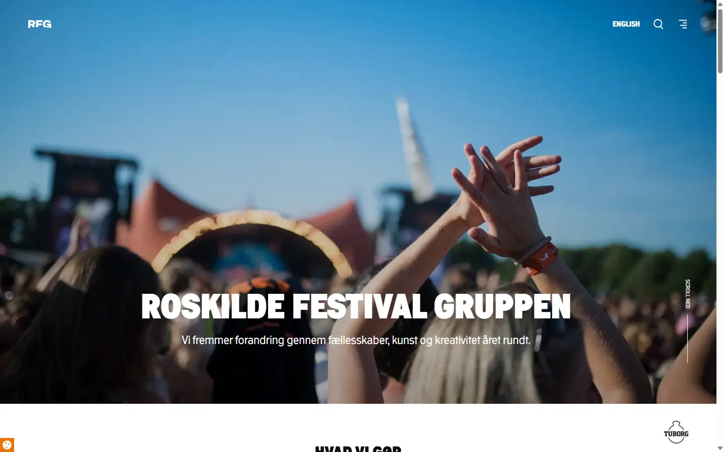
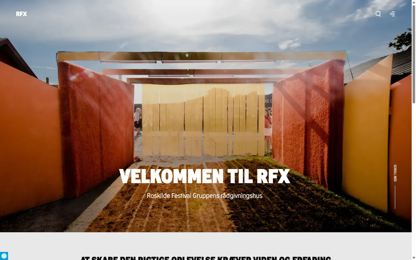
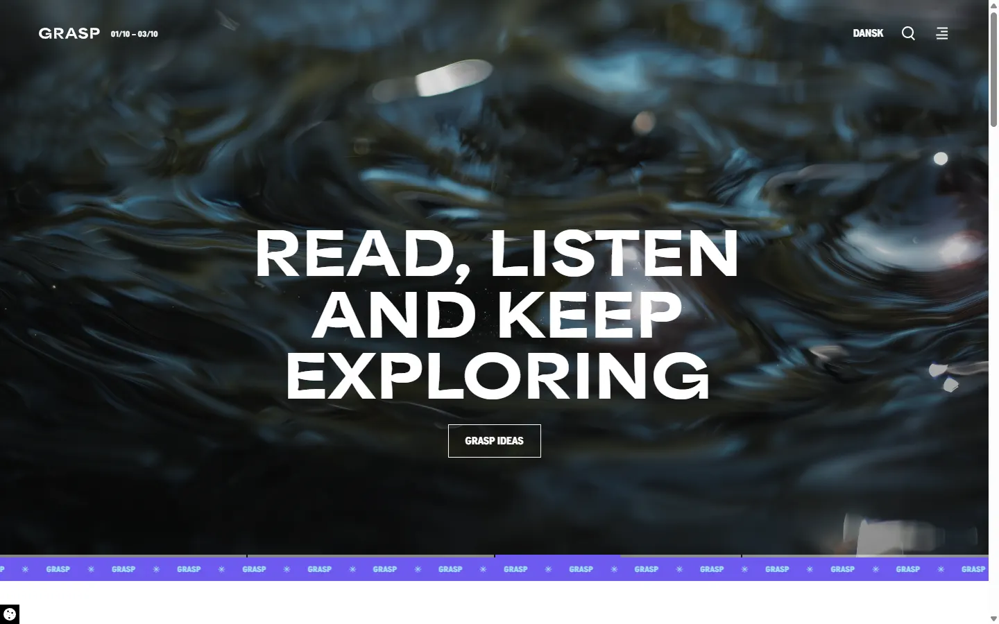
You can see it in the live sites. GRASP swaps the display face for Area Extended Extra Black and goes violet. RFX goes blue. Orange Orbit drops the all-caps headlines, rounds its buttons into pills and opens up the gutters. The header, navigation and full-bleed hero underneath are the same components on every site.
The hardest call was the programme: working out how one programme could be shared across the brands, instead of being built again for each of them.
The model also scales: a new venture gets a working, accessible frontend on day one instead of a blank page.
- data-theme
- :root
- primary
- #FF7300
- radius
- 0
- headline
- uppercase
One set of names, five themes
| Token | Festival (:root) | RFG | RFX | GRASP | Orange Orbit |
|---|---|---|---|---|---|
| context-primary-color | #FF7300 | #0D0D0D | #327FF6 | #6E5AF0 | #EE7203 |
| context-primary-accent | #000 | #FF7300 | #000 | #000 | #000 |
| context-secondary-color | #E7E7E7 | #E7E7E7 | #E7E7E7 | #E7E7E7 | #FFA463 |
| context-tertiary-color | #F5F5F5 | #F5F5F5 | #F5F5F5 | #F5F5F5 | #F5F1ED |
| context-quaternary-color | #D66501 | #313131 | #2B68C7 | #A0E6F0 | #EAE3DB |
| context-white-accent | #FF7300 | #FF7300 | #327FF6 | #6E5AF0 | #EE7203 |
| fontFamily-display | Roskilde 4000 VF | (inherits) | Roskilde 4000 VF | Area Extended Extra Black | Roskilde 4000 VF |
| fontFamily-body | Roskilde 4000 VF | (inherits) | Roskilde 4000 VF | Roskilde 4000 VF | Roskilde 4000 VF |
| textTransform-headline | uppercase | uppercase | uppercase | uppercase | none |
| textTransform-cta | uppercase | uppercase | uppercase | uppercase | none |
| fontWidth-heavy | 900 | 900 | 900 | 900 | 700 |
| borderRadius-button | 0 | 0 | 0 | 0 | 125rem (pill) |
| gridGutter-none / -tablet | .5 / 1rem | .5 / 1rem | .5 / 1rem | .5 / 1rem | 2 / 3rem |
- Colour architecture: 12 contexts (black, grayDark, grayLight, white, primary, secondary, tertiary, quaternary, uiDisable, uiError, uiSuccess, uiInfo) × 8 roles (color, accent, onAccent, contrast, tone, tint, navigation, error). A component asks for the accent on a primary surface (context-primary-accent), never for orange.
- Shared type scale, mobile → desktop: largeDisplay 5.625 → 13.5rem · smallDisplay 4.75 → 10.5rem · largeHeadline 4 → 7.25rem · mediumHeadline 3.25 → 4.75rem · smallHeadline 2.75 → 3.5rem · xSmallHeadline 1.75rem
Deep dive: login
Login is the front door, and on a festival platform it takes the most pressure. There are on-sale moments with huge traffic. There are volunteers and association members. And there are people who sign in once a year and have forgotten how.
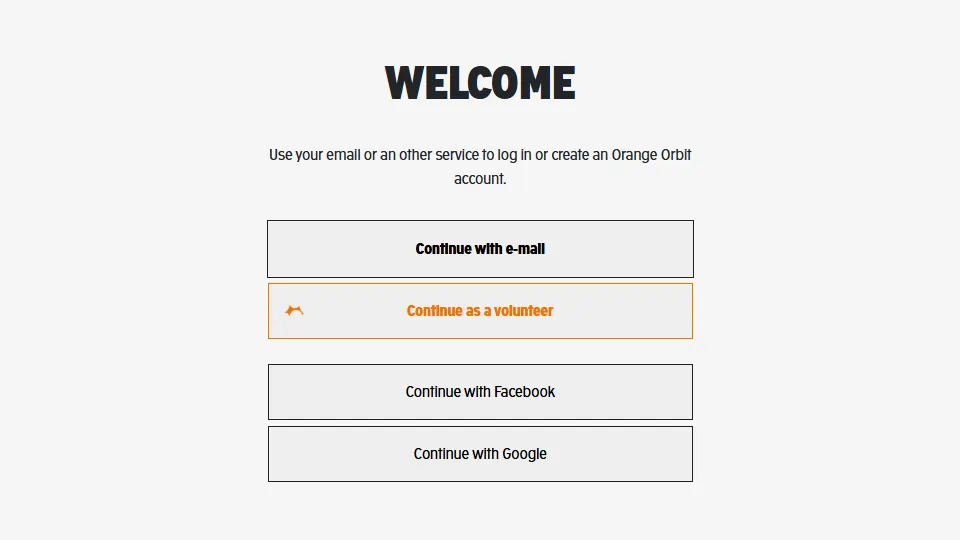
The as-is login was built differently on each property. I rebuilt it once, as a single flow, and spent most of the design effort on the unhappy paths:
- Context on arrival: you always know which account you're signing into, even when you've come from another brand.
- Recovery that always leads somewhere: no dead ends, no loops.
- Human error states: each failure says what happened and what to do next.
Login: as-is → to-be
Before
- A different login on each property
- Ambiguous which brand/account you are entering
- Recovery paths that dead-end or loop
- Generic, unhelpful error states
After
- One login flow, built once to work across the brands
- Clear context: who you are signing into and why
- A recovery path that always leads somewhere
- Specific, human error and edge-case states
Deep dive: the programme
If login is the front door, the programme is why people come in. It's the densest and most-used part of the platform, with hundreds of acts across stages and days. It has to work for two very different moments: planning at home weeks ahead, and finding out what's on near you right now in the middle of the site, with one bar of signal. The old programme treated those as one screen. The redesign treats them as one data model with two views.
The programme lives as structured content in the headless CMS, not as hand-built pages. The same data drives the full line-up, search and filters, every act page, and each person's saved schedule. When a time or stage changes, which it always does, it changes everywhere at once.
Result
The festival and its ventures now share one frontend instead of four. Login is one flow, and the programme is one content model.
It was fun, and it was difficult, often at the same time.